
Timeframe
January - March 2021
Role
Tools
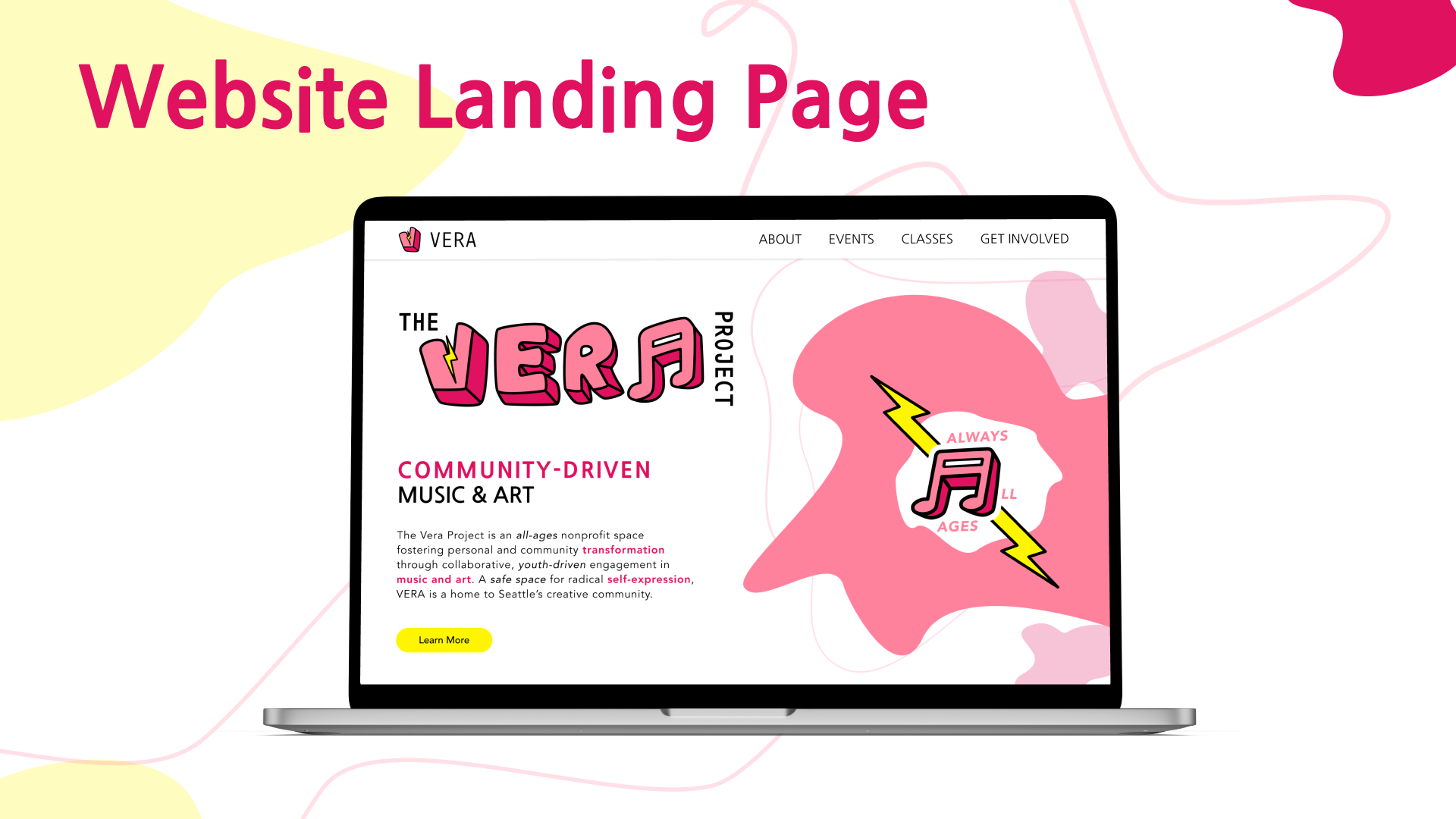
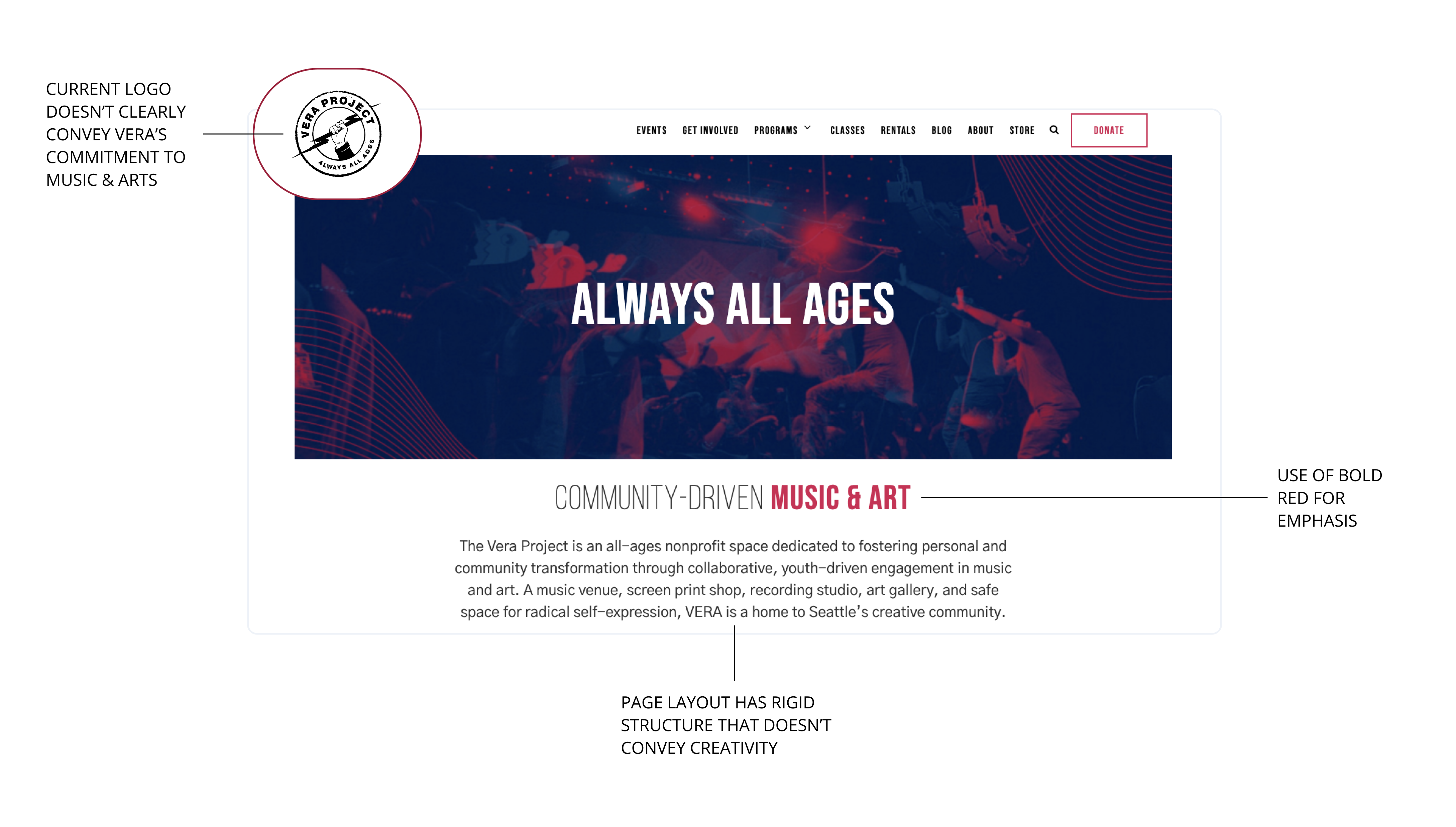
Taking a quick look at their current website landing page, the design appears rigid, which doesn't fit their mission, which is to foster personal and community transformation through collaborative, youth-driven engagement in music and art.
Design Question
How might we design a cohesive visual system for The Vera Project?
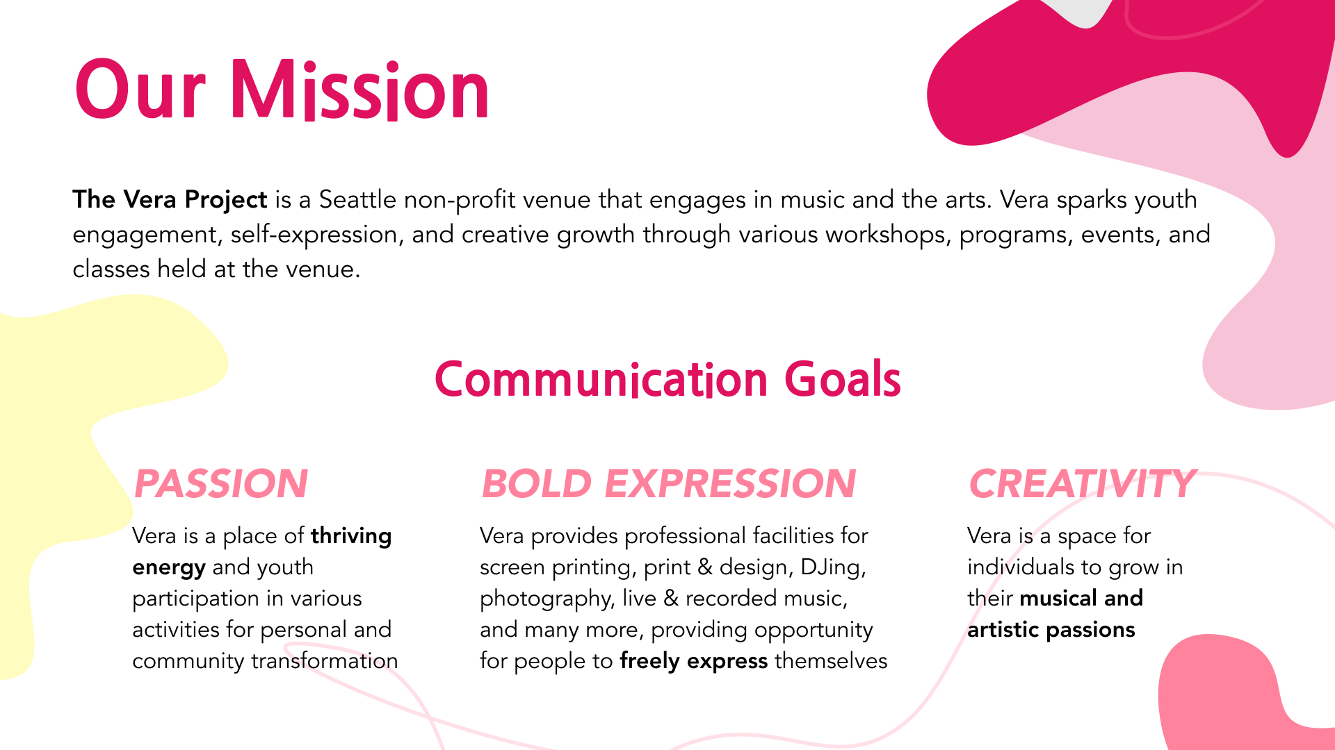
Communication Goals
To redefine Vera's visual system and make it more cohesive, I brainstormed three main themes that I wanted to align with their mission and values.
Bold Expression
Vera provides professional facilities for screen printing, print & design, DJing, photography, live & recorded music, and many more, providing opportunity for people to freely express themselves.
Creativity
Vera is a space for individuals to grow in their musical and artistic passions.
Passion
Vera is a place of thriving energy and youth participation in various activities for personal and community transformation.
Logo
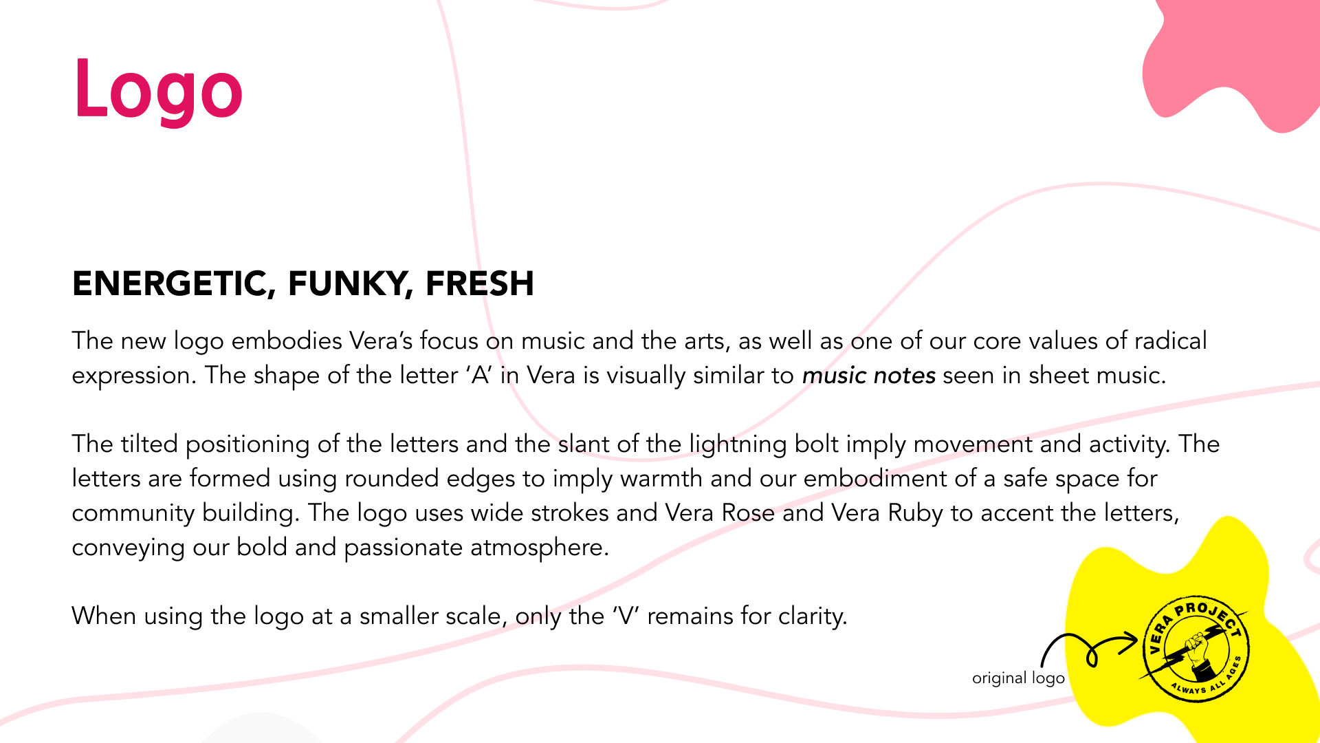
After conducting an analysis of Vera's current branding on their website, I found that their current logo doesn't appear to fit in with their foundational mission. The current logo features a hand holding a lightning bolt, which conveys a passionate and ambitious energy; however nothing screams music and the arts.
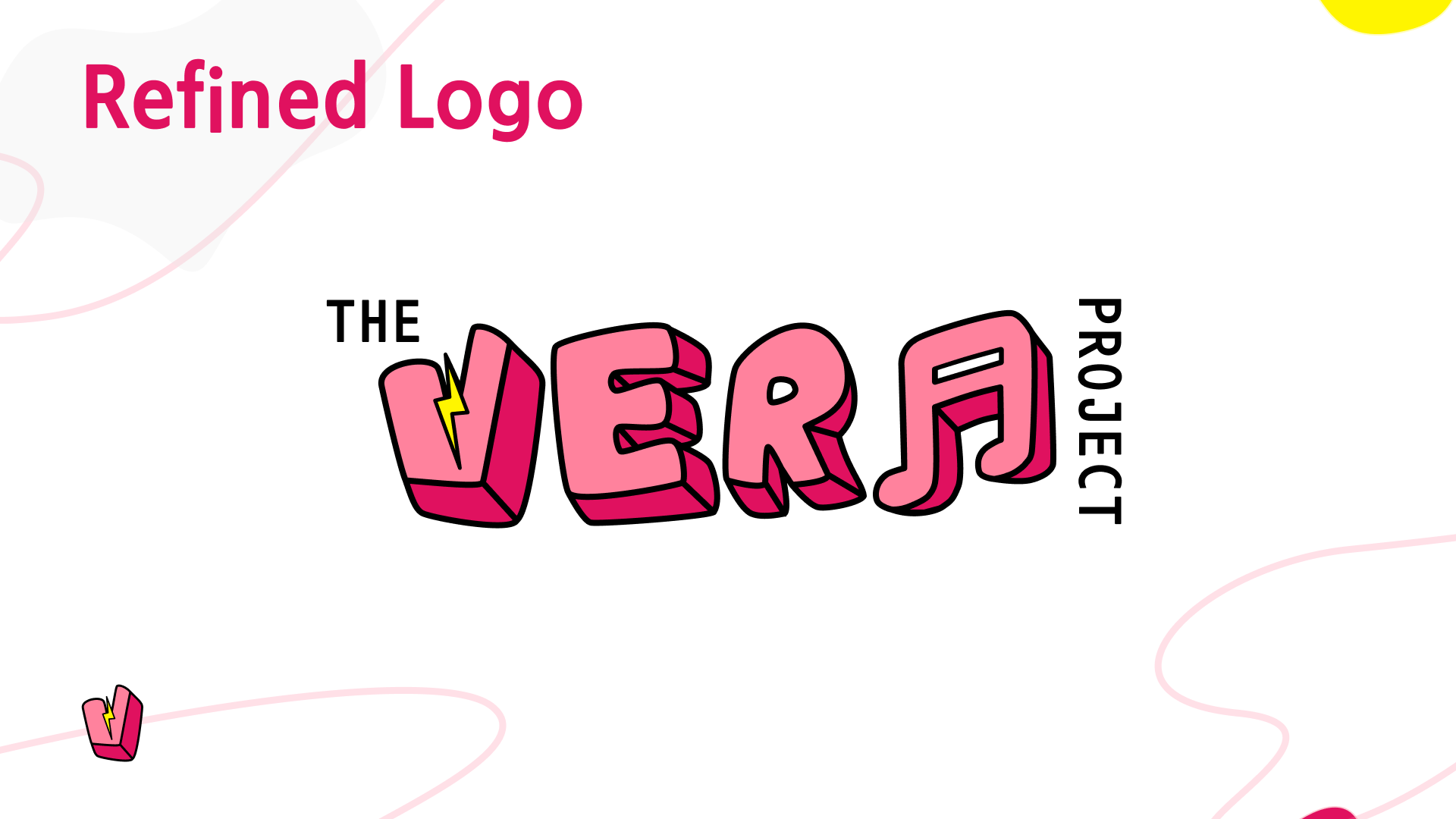
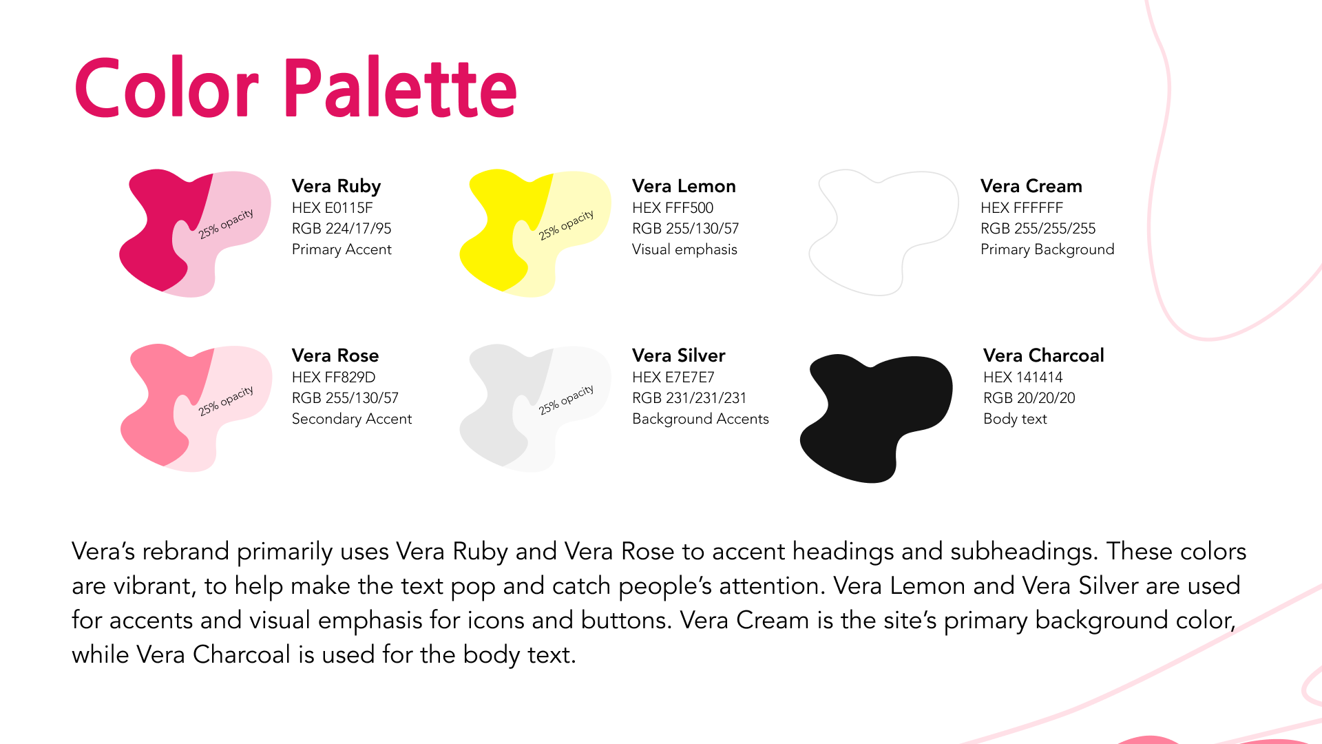
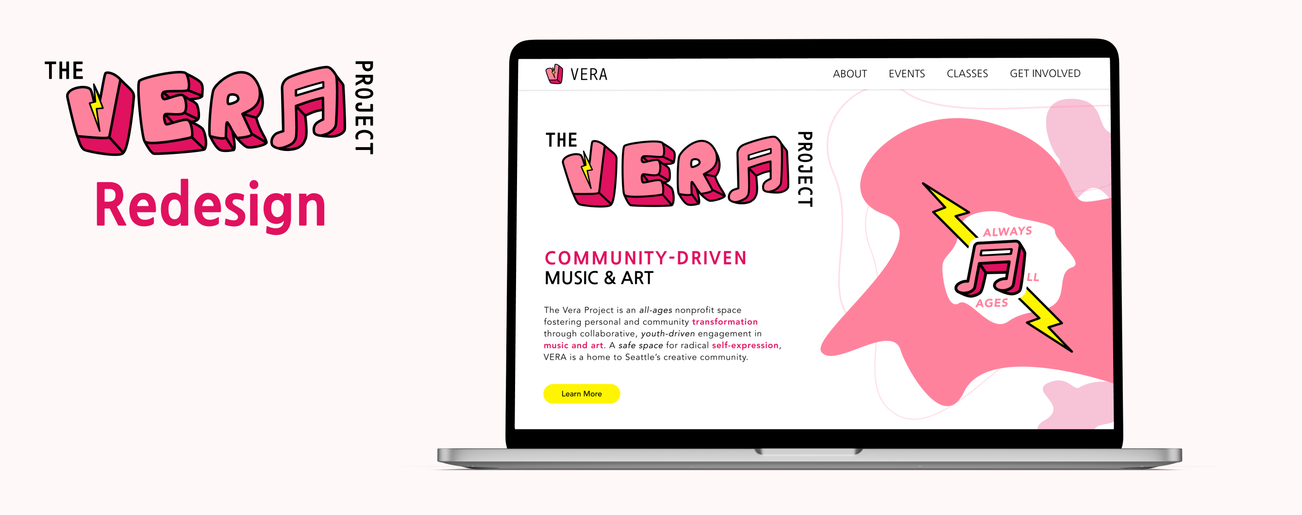
To emulate emotions of creative freedom, I used bright colors and incorporated musical elements in the logo iterations.

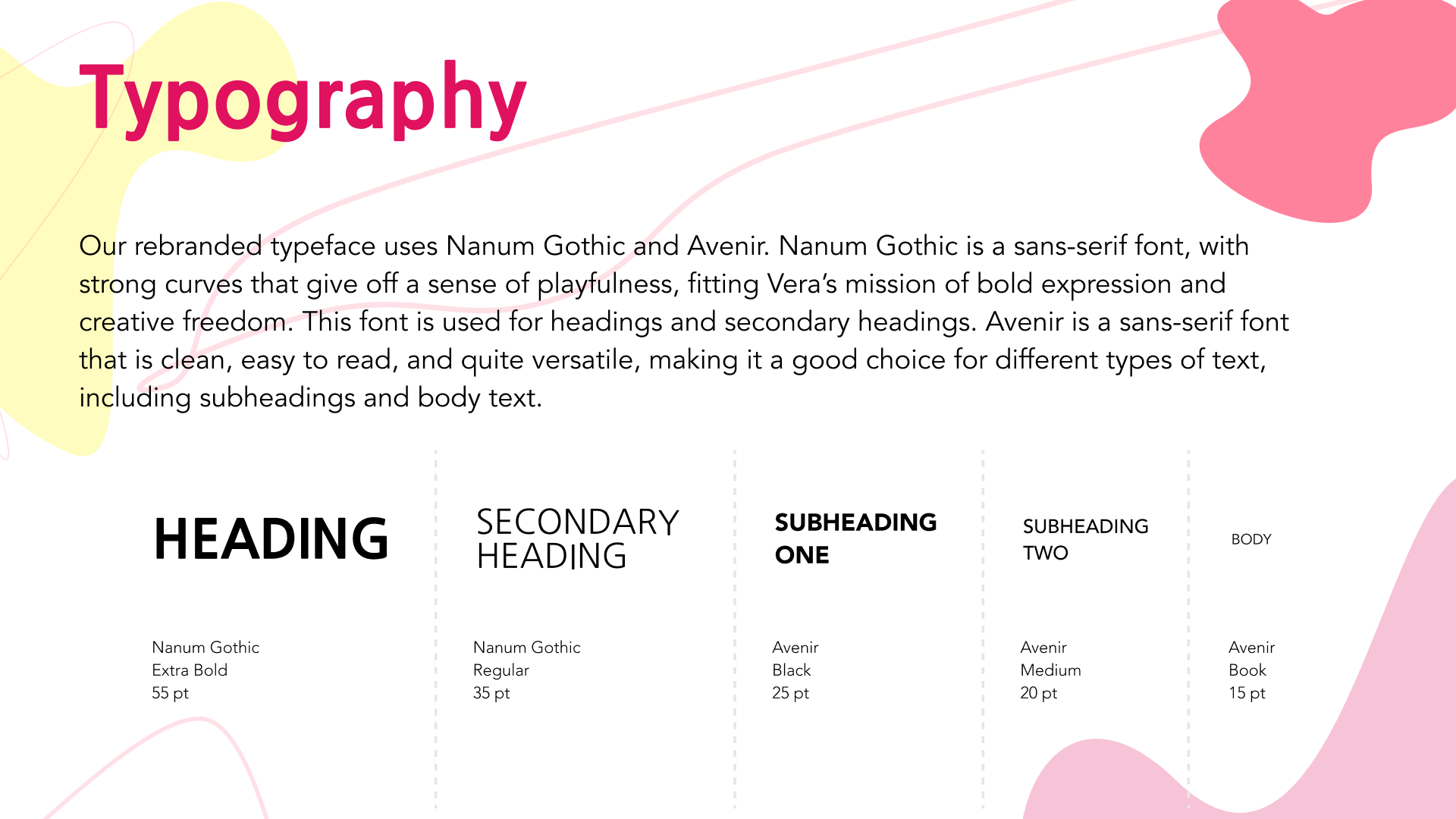
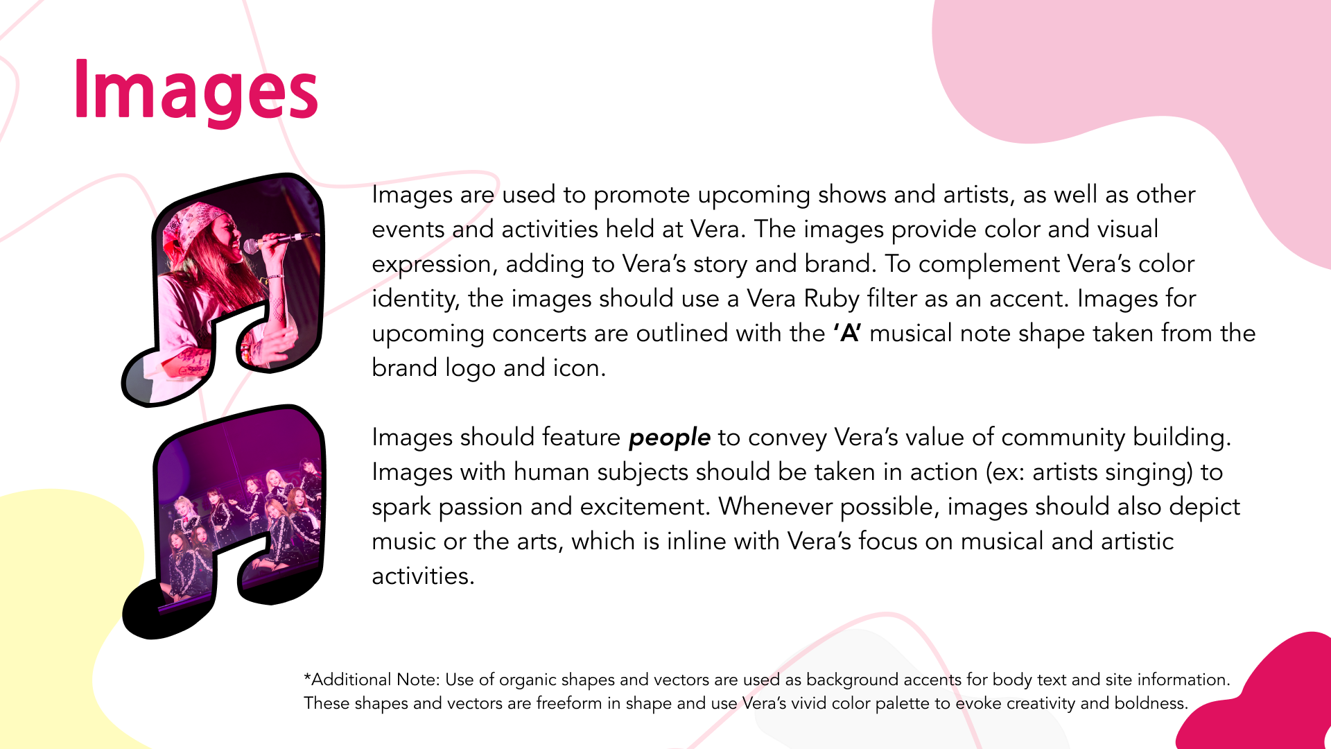
Brand Book
The final deliverable consisted of a brand book, detailing Vera's rebranded components. For the full brand book, see this document.
