Husky Buddy emerged from an University of Washington Human Centered Design & Engineering course project, HCDE318 - Introduction to User-Centered Design, where my team aimed to develop a solution to streamline the formation of online groups and boost student engagement amidst challenges presented by the COVID-19 pandemic.
Experiencing the transition to remote learning firsthand, my team and I witnessed the effects of 'Zoom fatigue' and the difficulties of connecting with classmates online. Motivated by these experiences, we chose to address the importance of community-building, recognizing its potential to foster greater student engagement in online learning environments.
Timeframe
March - June 2021
Team
Key Contributions
Problem Overview
In early 2020 when Covid first emerged, many higher education institutions in the US cancelled in-person instruction and transitioned to the new era of Zoom University. In a report on a random-sample survey of more than 1,000 students, 65% reported that they had fewer opportunities to collaborate with peers, and 42% said that engagement in course content was an issue (Means and Neisler, 2020↗). Furthermore, another similar study found that 78% of respondents feel that online classes are unengaging, and 75% miss having interactions with instructors and peers (Read, 2020↗).
Design Question
How might we support students at the University of Washington in fostering connections, meeting peers, and building engagement amidst the challenges posed by online learning during the COVID-19 pandemic?
Product Deliverable
Husky Buddy helps students connect with peers in their classes through community forums and groups, creating a space for encouraged engagement and meeting like-minded individuals beyond the black screens of Zoom University.
Research: Interviews
To understand our project goals and problem space, we conducted interviews with our target user group (students at UW). Our team conducted three 30-minute semi-structured interviews over Zoom, asking questions to get insight on their experiences with online learning and making connections with classmates and instructors during the pandemic. We then analyzed the responses by grouping responses together in clusters to see if there were any patterns or themes in the experiences of the students.
Interview Insights
Students express frustration with having to manage multiple apps for communication, such as Canvas, Instagram, Discord, Messenger, etc.
A centralized platform serves as a one-stop solution for tracking peers, instructors, and class-related content and communications.
Students feel there is a lack of interaction in online learning, making it difficult to stay engaged and follow along with the coursework.
Increase engagement through community forums where students actively converse with instructors and peers regarding course-related content.
Students desire opportunities to connect and interact with their peers.
Give students the agency to create and join groups, fostering collaboration with peers on projects and coursework.
Ideation: User Personas
Our team analyzed the interviews to identify specific pain points, goals, and desires that our interviewees expressed. We used these interview insights to create user personas that encompassed all the pain points and goals of our users. Creating these personas gave our group better direction as we now had a hypothetical picture of who we were designing for:
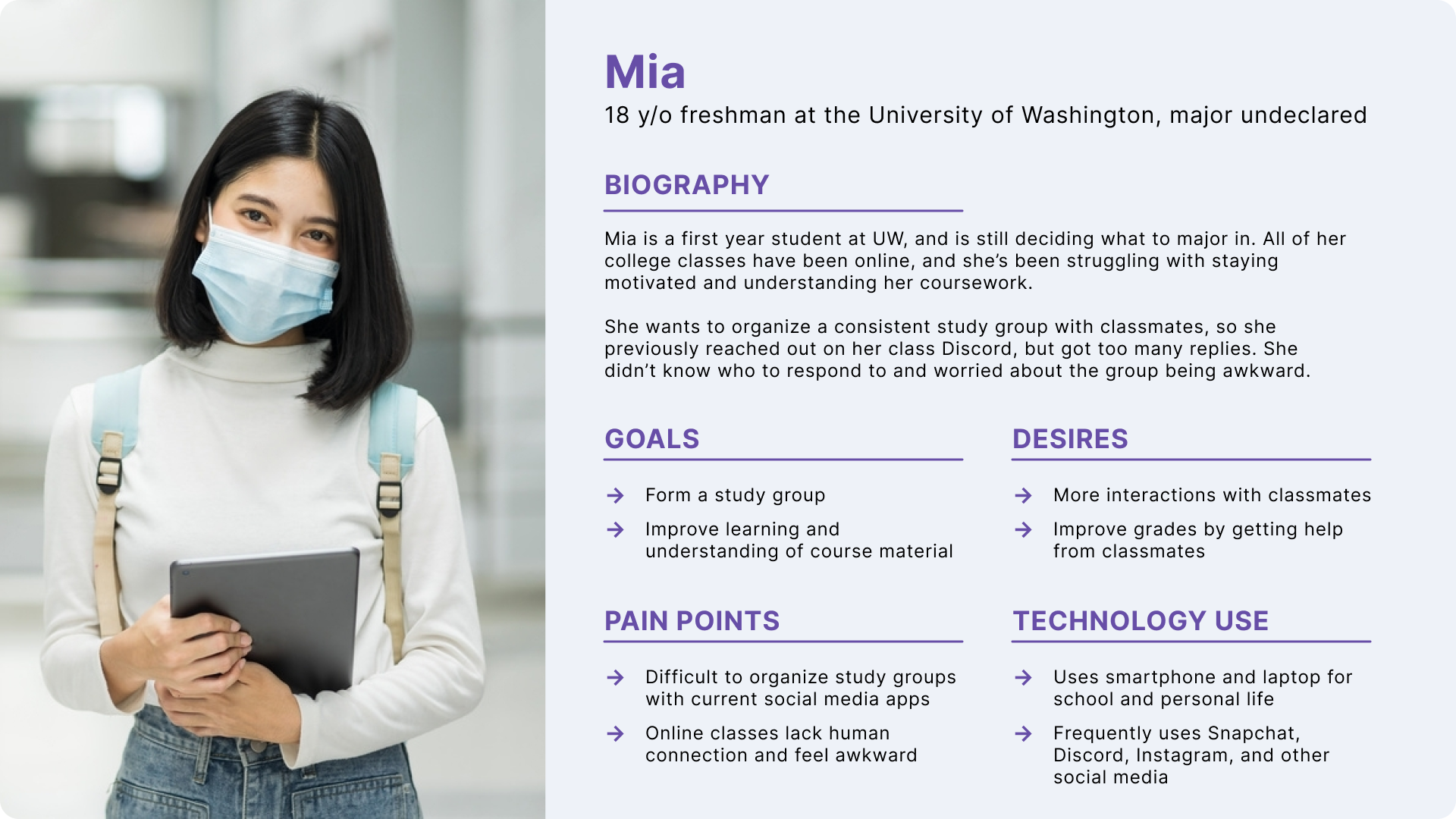
Mia, a freshman at UW
Ideation: Journey Map
Using our persona, Mia, we highlighted a couple goals from our user interviews, specifically touching on the interests of forming study groups and having more ways to interact with classmates. We created a user journey map of her experience with creating a study group and and hosting a group meeting. This journey map helped our team to locate positive points to build upon and negative points to resolve in our own mobile application.
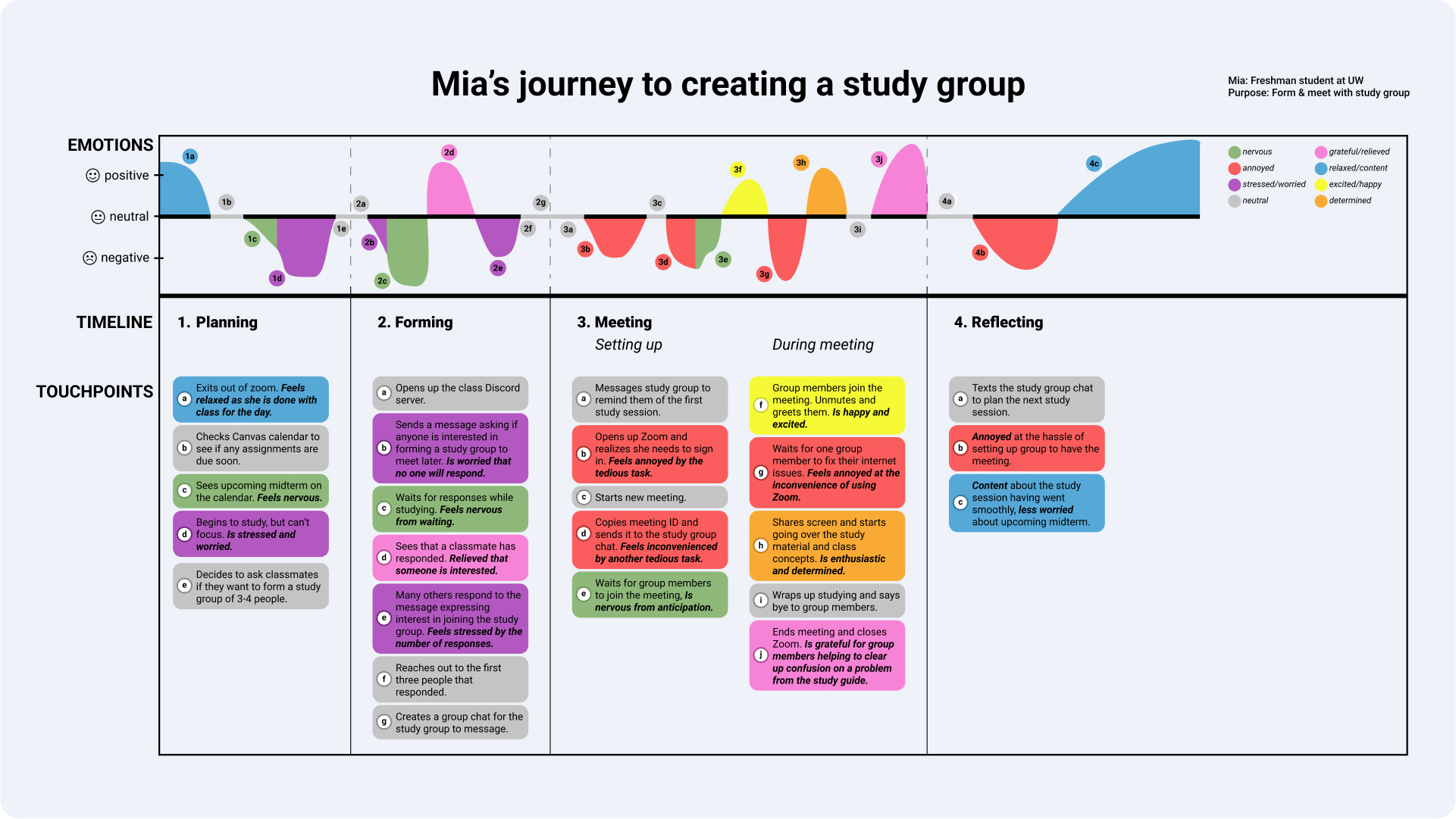
Mia's journey to creating a study group
We found that users tend to experience more negative emotions (annoyance, frustration, and stress) during the formation of and meeting with study groups. Thus, we wanted to steer our product towards an centralized application that would allow users to form and meet with their groups without the hassle of having to use multiple applications.
Ideation: Design Requirements
Now that our team had a clearer project direction in mind, we formulated some design requirements to focus on addressing the pain points we identified from our interviews and user persona.
Centralized Platform
Content Sharing
Notification System
Ideation: Lo-Fi Prototype
Using our design requirements, we brainstormed wireframes for our platform, designing screens to map out user flows for our app. For the full wireframes, see this document.
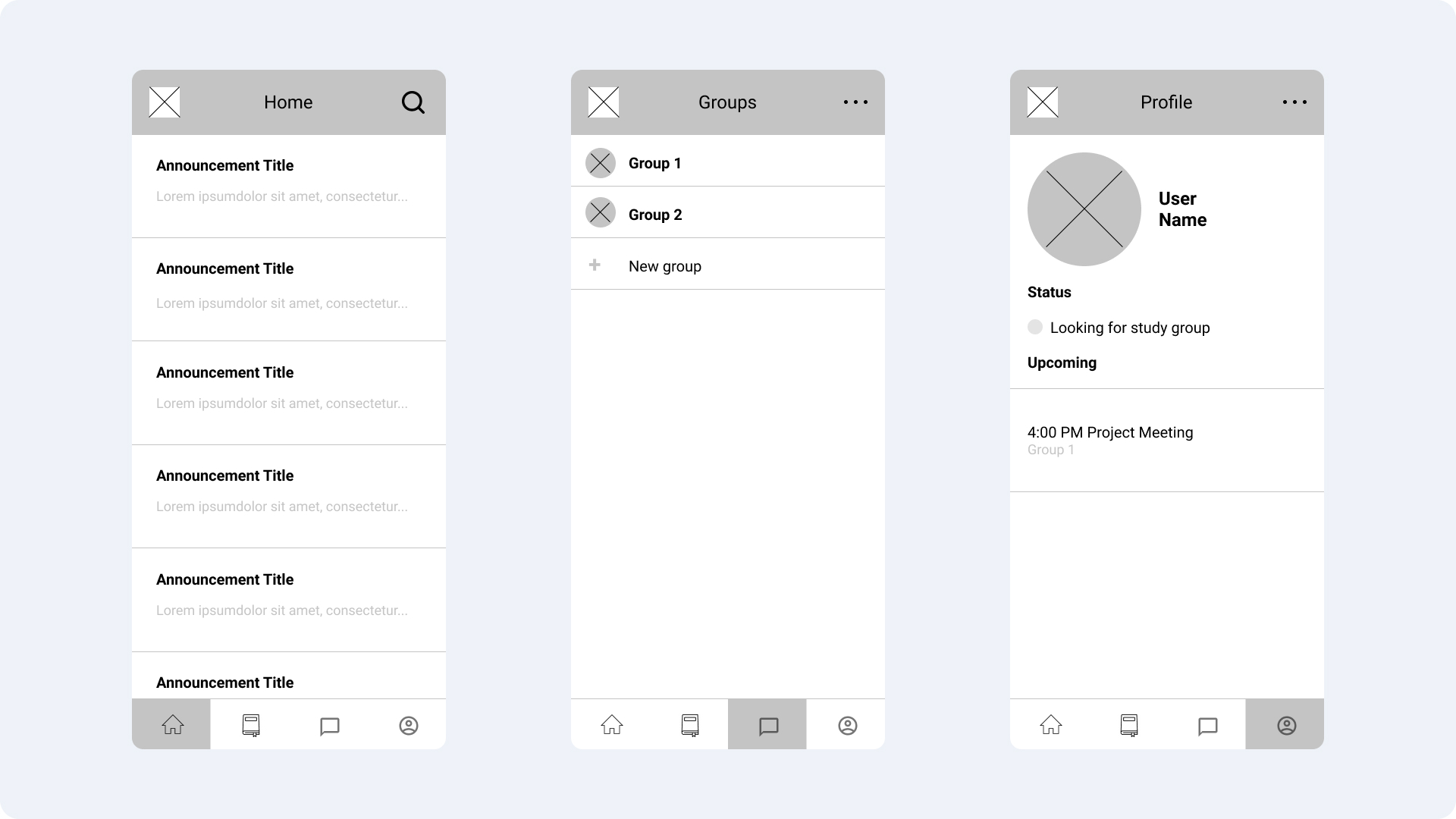
Some of the wireframes that our team developed
Iteration: Usability Testing
Interactivity components were then added to link the wireframed screens together into user flows. These flows then underwent usability testing to gauge the user flow, feasibility, and intuitiveness of our mobile platform design. Our team tested with a total of 6 participants, all students attending the UW. Our tests were all conducted over Zoom, where we had one team member facilitate the session while the others took notes.
Notes from the test sessions were grouped to find any patterns or themes, focusing on where participants struggled to complete an action or had difficulty with the interface, what features they liked, and any suggestions for improvements.
Usability Test Finding #01
A few participants expressed feeling overwhelmed by the announcements content on the home feed, making it too much to take in at once.
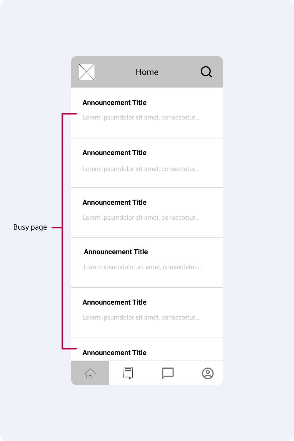
Overcrowding of content on page
Usability Test Finding #02
Several participants experienced difficulty in navigation due to icons being misaligned with their designated pages. Specifically, the third tab resembles a chat message icon, which misled participants to assume that the page was for messaging, rather than for accessing 'Groups'. Additionally, inconsistencies were observed in the icon styles across the prototype.
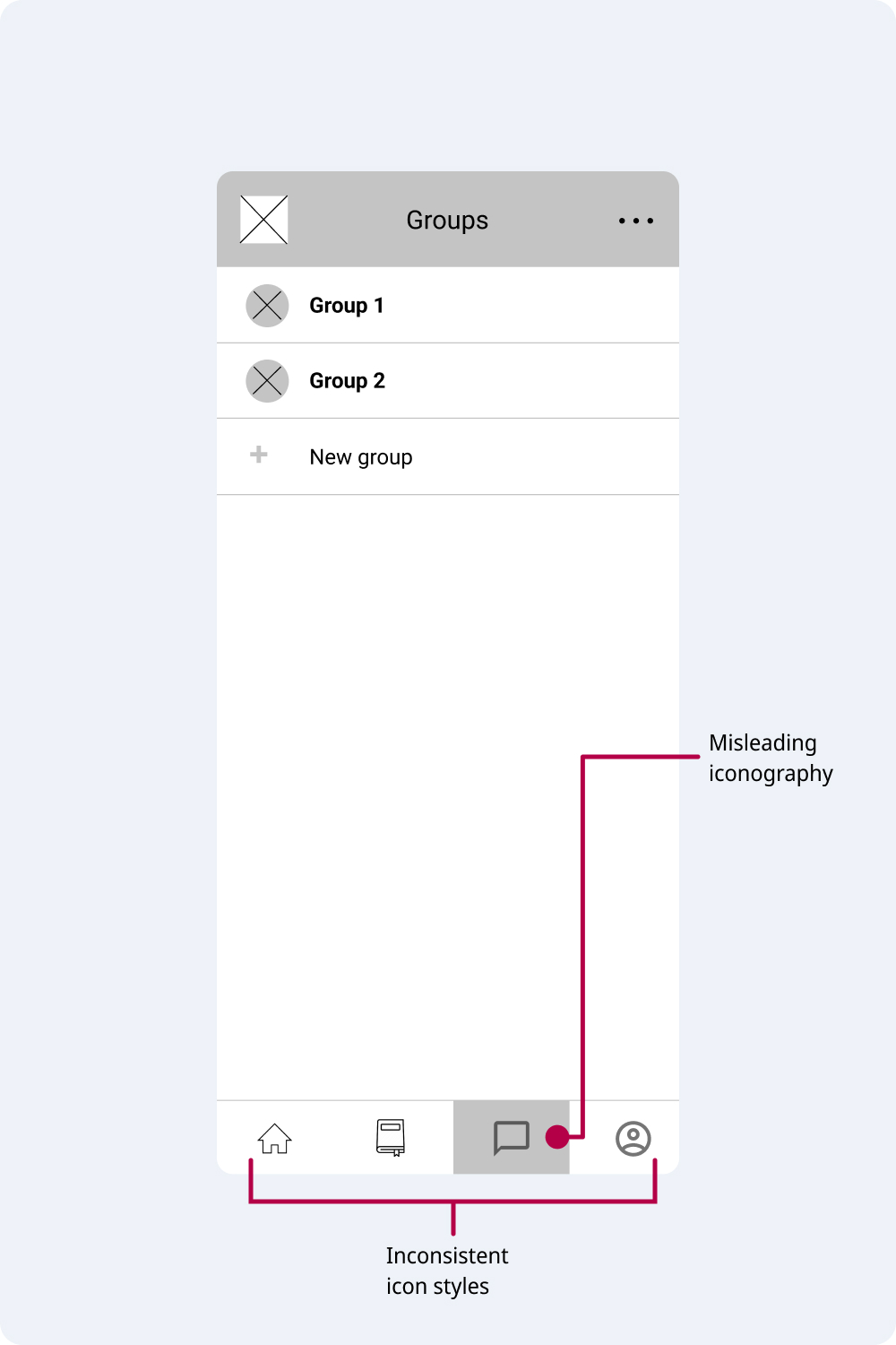
Misaligned icons
Iteration: Lo-Fi to High-Fi Prototyping
Based on feedback from the usability test sessions, our team began working on transforming our platform from a low-fidelity to a high-fidelity prototype. Brand color, images, detailed, components, and additional interactivity were implemented.
My team members focused on the profile page and discussion forum for classes, while I focused on group creation and filtering for classmates. Additionally, I designed the Husky Buddy logo that was used for our app. Since the mascot of the University of Washington is an Alaskan Malamute, I incorporated the outline of a paw print into the 'HB' letters of the app logo. Gold and purple are the school colors, which I implemented as colors of the logo.
Husky Buddy app logo, shown at three different size variations
Final Design
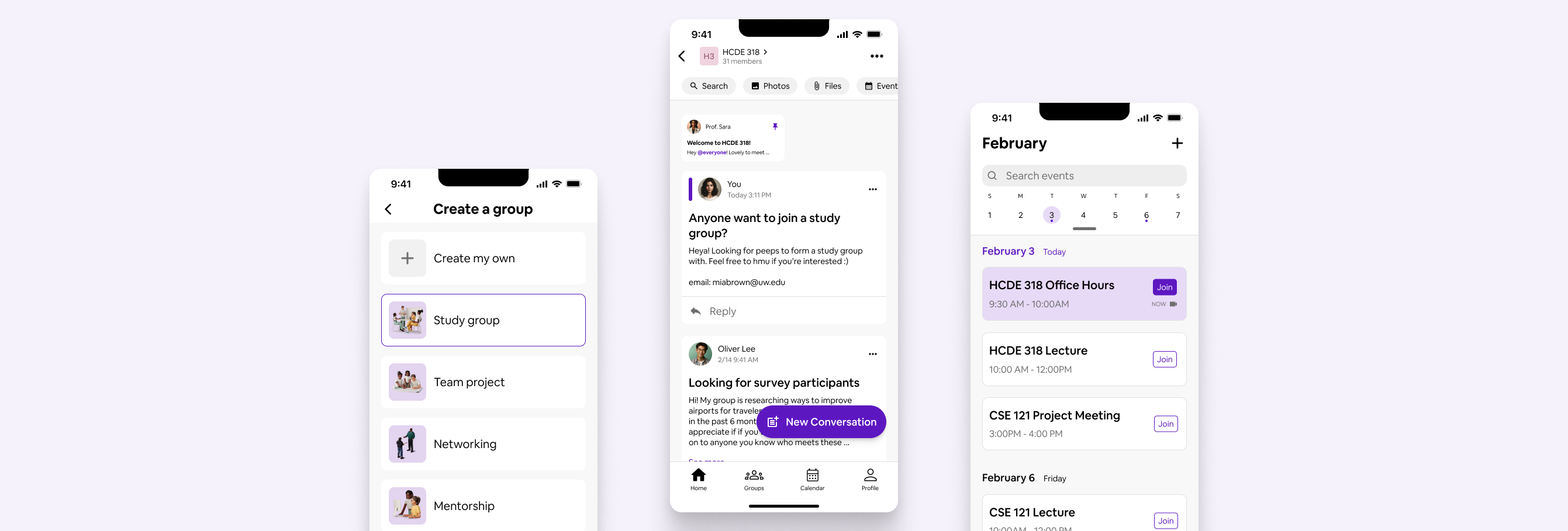
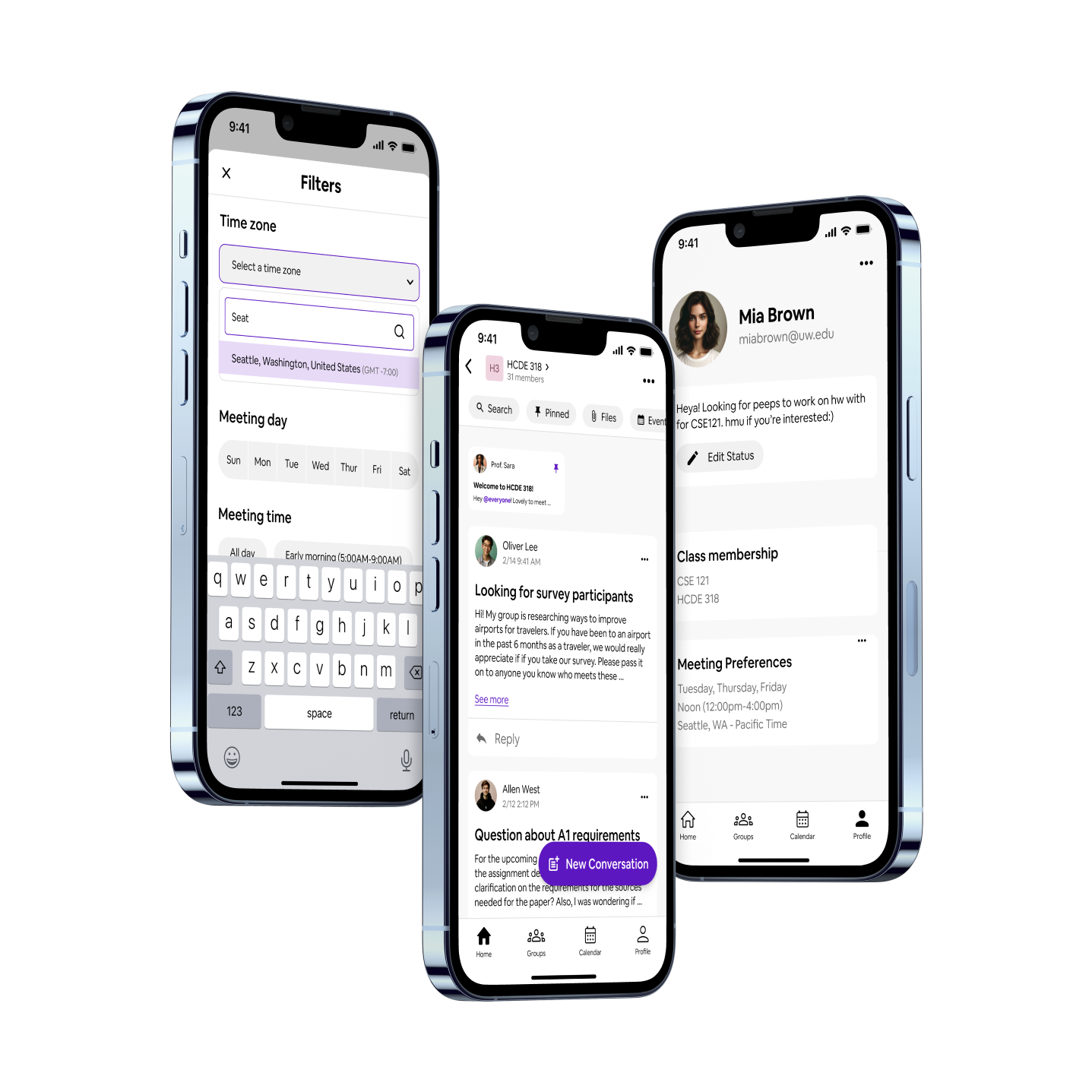
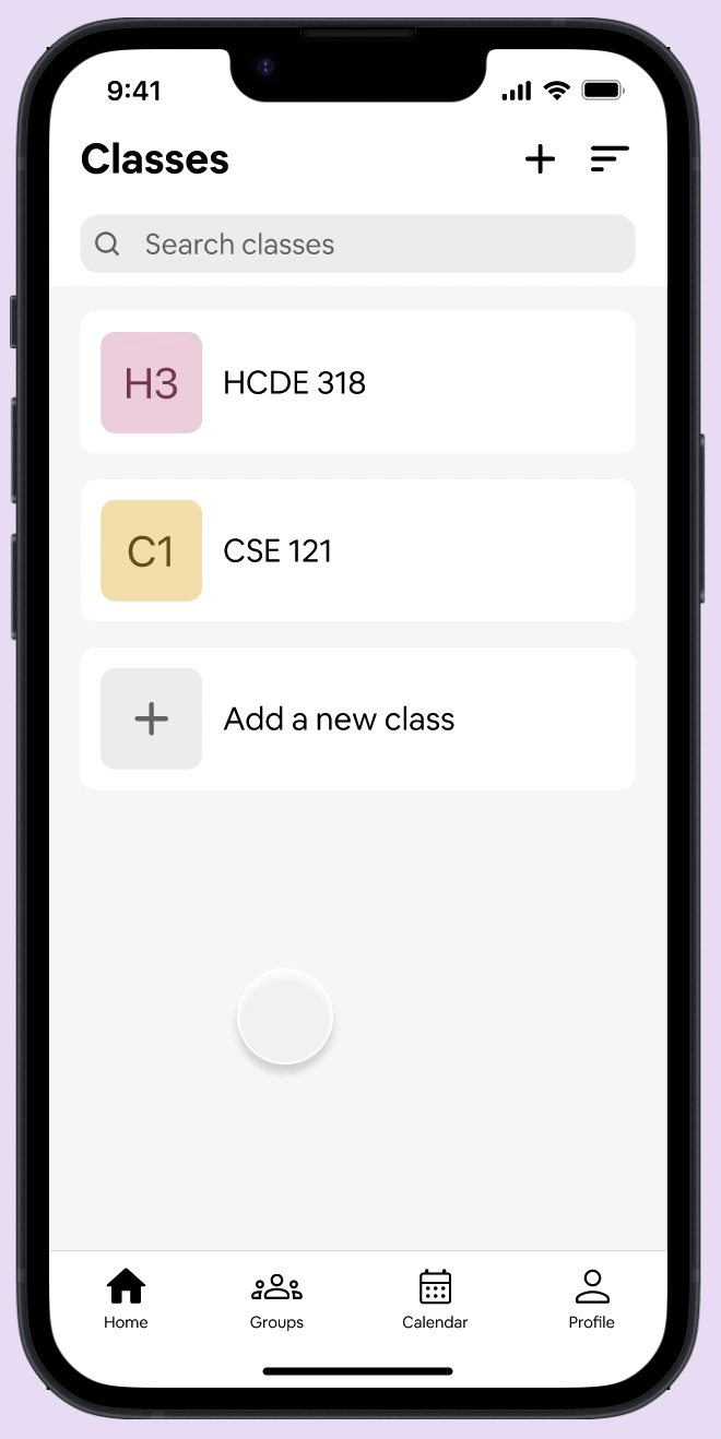
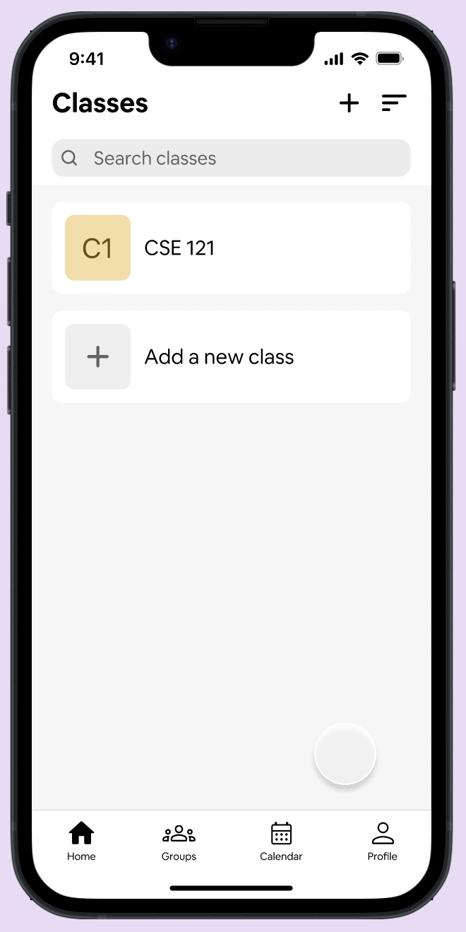
Class announcements are now displayed in the community forum pages their respective classes, reducing the cognitive load for users.
The home page houses all the classes that the student is a member of. Students can create, view, and respond to conversation posts in the class community pages, sparking engagement with their peers and instructors. Important announcements can be pinned to the top of the community page for quick viewing.
Final Design
Students are notified via the Husky Buddy app of upcoming and ongoing meetings and events.
The calendar page displays all events, such as classes, office hours, group meetings, etc.
Final Design
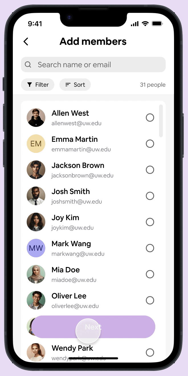
To find students with same preferred meeting times, students can filter when looking for classmates to form a group with.
The groups page houses all the groups that the student is a member of. Students are able to chat, share files, and virtually meet with their groups.